Interview with painter Ryan Jackson
in his classroom-turned-studio
at The Christian Academy, Brookhaven, PA,
13 August 2010

My interview with Ryan Jackson, a young fine artist and illustrator from the Philadelphia area, was a thrilling adventure. He had invited me to come to the high school where he teaches so that he could show me some of his works there; the school allowed him to use his classroom as a studio during the summer. As I pulled up to the garish orange-and-gray school building (where I once interviewed—unsuccessfully—for a position as an English teacher!), I had no idea what an amazing space I would enter. Ryan had taken the classroom and transformed it into a private art gallery and art history educational venue just for me. He had set up the movable internal walls to create just the right shape to showcase his best works. He had hung his paintings chronologically around the room, carefully lighting each one for best effect. Along one wall sat a long table, strewn with dozens of those lovely, high-quality, glossy-paged, table-top fine art books. Here are images of his studio-classroom:


Before we sat down for the official interview, Ryan took me slowly around the room, explaining and describing each piece. He has gone through several stylistic phases in his short career: several experimentations in photorealism including a black-and-white stage, a “blue” period, and some work in visual collage; more recently, he has switched to the demanding and dangerous techniques of Baroque glazing. In what follows, I will intersperse our actual recorded interview with reconstructed conversations and my own descriptions of what I saw that day, enhanced with images of most works we discuss. The photos that are grainy or ill-lit, I took with my little point-and-shoot digital; the higher-quality photos come from Ryan’s excellent website, www.ryanjacksonart.com.
I. PHOTOREALISM
In college, Ryan use a style of painting made up of little hatch marks, almost like pointillism. It depicted a chaotic sense of reality and was inspired by Antony Gormley’s “Quantum Cloud.” He said:
 RJ: I graduated from Rhode Island School of Design in 2001 and then started showing in galleries for a couple of years. But I didn’t like the work I was doing; I didn’t feel as if it was representing my Christianity, my relationship with Christ. So I took several years off from painting, got married, and over the past five years have been revamping my style, exploring painting, and trying to find a way to accomplish that representation.
  IA: You started out with a very literal photo-realism: painting in black-and-white, using just oil paints on canvas: flat, kind of smooth. Am I describing that correctly? RJ: Yes. I was inspired by several painters, including Gerhard Richter, Damien Hirst, Rudolf Stingel, Eberhard Havekost, Neo Rauch, and Matthias Weischer, some of whom are considered members of the “New Leipzig School”. I have also been influenced by Michaël Borremans, Tim Eitel, Luc Tuymans, Alberto Giacametti,
and John Currin.
Part of this photorealist phase might, in retrospect, be called
Jackson’s “Blue Phase 2005-2006”
During this time, Ryan used a flat, glazy style and painted several black-and-white utopic/dystopic scenes, including the following:

Manhattan Project

Disney’s EuroRail
And several still-lifes, including a series of candle scenes:


We talked about how painting from photographs used to be considered “cheating,” just as digital photography wasn’t considered “real” photography. Now the artistry involved in each process is recognized.
Much in the vein of the photorealist style, Ryan painted (and continues to paint, especially on commission) portraits, including a series of pictures of orphans and from pictures taken on missions trips around the world. These include:

An orphan

An image from a missions trip
Ryan’s next phase, closely related to his early photorealist work, and still influenced by the Leipzig School, especially Matthias Weischer, Neo Rauch, and David Schnell, was what I most readily identify as “Cityscapes.” In this period of experimentation, Ryan said he tried just “letting paint do its thing; letting accidents happen.” He used collage, spots of raw canvas peering through, paint drips, marks of turpentine, marks of the trowel. Here are two cityscapes/landscapes:


There is one uncharacteristic piece in this phase inspired by the film “Metropolis”—a German film from 1927 that has recently been restored after the discovery of lost footage. I don’t have an image of it.
II. ART IN SERVICE TO FAITH
Before we talk about Jackson’s current phase, a dedicated study of the materials and techniques of the Baroque masters, here is a conversation we had about how a Christian may use art in direct service of social needs and the communication of Biblical truth.
IA: There are a couple of problems that we face as Christians in the arts. One is: How do we retell the Biblical stories in new ways. Another is: How do we make a difference in the world by means of art. There are a lot of different ways that people have solved these problems: some have done it by subject matter, some have done it by political activism, getting involved. So: The first way that you did it was using your art financially. Selling your paintings and then giving the money to causes? RJ: Yes. Selling the paintings and then using the money, which is a way my wife Hillary and I found that we could give. Just doing paintings, whether it’s of orphans or the missions series. And that’s been opening up more and more doors. The missions ones: I guess we’re on the third series now, of paintings. I’m selling those, and the money is going off to missions or to support orphans. IA: To what institutions have you given those donations? RJ: To Calvary Chapel in Philadelphia, to their missions, and then they are either sending it to missionaries or using it to buy Bibles. And also to Living Hope Adoption agency. My mother has adopted her two sons through that agency.IA: When you sell these paintings, have they been to private individuals? Have churches or institutions bought them? And where did they buy them? Were they shown in galleries, or was it through personal contacts? RJ: It was either through personal contacts, commissions, or through Calvary Chapel; Calvary is actually setting up spaces now to put the works up, to put up photographs, paintings, and sell the work, and then the money goes towards missions. IA: OK. And then the other way that you’re making your faith work in your art is showing the same-old Bible stories with contemporary people in them, and in contemporary settings. Am I describing that all right?
RJ: Yes, that’s right. IA: So by doing that, you’re saying that the story is still relevant; you’re showing that it is timeless? What else does that show? How else does that work? If I were commissioning a work (I wish I could!) and I wanted it to be a particular Bible story, how would you go about deciding to represent that? RJ: If you just said, “I want you to paint Job” or something like that? I guess I would do a lot of research, looking back at old paintings, doing a ton of researching, seeing what people had done before, and taking ties from some of the other art history that I know. Kind of like the Hosea one with the three light sources. Ryan has one amazing work in which he depicts Hosea and his wife Gomer just after Hosea has redeemed her from prostitution. It uses direct, but subtle, narrative representation. Objects or elements of the painting have symbolic resonance: the door is the door out to “The World” (in the worst sense). Stairs represent Gomer’s fall into infidelity and also The Fall of all humankind; black represents sin; there are three light sources (representing three-fold Redemption). There are also allusions for those who really know their art history: a framed image on the wall is reminiscent of the images-within-images in many of Vermeer’s works; Hosea’s hands are straight out of a work by Jan van Eyck. In order to appreciate the rich layers of meaning in Jackson’s work, you really need to know art history, to be fluent in the traditional vocabulary or standard symbols. This prompted me to ask, “How much of all that did you expect me to get, just by looking at the painting?” We ended up with a comparison between viewing such thoughtful visual works and what Bach said about his audience. Bach (according to scholar Michael Marissen) wrote his most complex pieces for several levels of audience comprehension and enjoyment:
1. First, there was the average person who would just enjoy the thrilling sounds of the music, melody and rhythm, without any intellectual analysis.
2. Second, there were members of the learned aristocracy who would get some obvious music allusions, such as “Oh, this metrical pattern is from a royal overture; it used to be played when the king entered the opera house, but set to this Psalm text, it means that Christ the King is coming.”
3. Third, there Bach’s advanced composition students, who would understand all of the most complex things he was doing with counterpoint, modulations, etc.
4. Finally, God, Who would get everything!
Ryan has a similar goal: on the one hand, he wants Christians without any art education at all to be able to relate to the immediately accessible realism; on the other hand, he wants those who have learned historical conventions and techniques to be able to revel in the intellectual and spiritual depth of his pieces.
RJ: There’s something else I don’t want to leave out: just sitting down and praying. That’s one thing I’ve been teaching my daughter every time we get ready to paint. She’s only four, but she comes into my studio and I’ll give her a section: “Here, paint this!” And later I’ll cover it over. But before we paint, we get down on our knees and we pray: “Lord, here are our gifts. We want this to glorify You. You show us what the subject-matter is; You show us how You want us to do this.” And that’s where the “Prodigal Son” series came from. Being willing to yield to the Spirit, being willing to let the Spirit change things. This is part of living into life: listen to His Spirit, walk according to the Spirit, walk according to His word, allow Him to be the influence. IA: So, you do your research, you do your prayer, and then you set up the scene: you sketch it, you draw out ideas, and then you might get friends or students to pose for the scene? RJ: Yes. I’ll often do little sketches, little thumbnails, little watercolors, and just start to play around with it. And then allow it somewhat to create itself. I’m getting ready to work one that is Jesus calling Matthew. I’m working from Caravaggio’s “Christ Calling Matthew”. In it, Christ is in the background. That’s one of the things I loved about Caravaggio: he wanted to paint these scenes that depicted real people and told the story, kind of like what I’m doing. At first, a lot of his paintings were not received well. In fact, some of them were taken out of the churches because they looked too real. The authorities thought, “The apostles should be very glamorous, floating off the ground almost, wearing beautiful robes.” His just looked like average, every-day guys with wrinkles and knotty hands. In it, you have Christ. He’s coming and He’s calling Matthew, and Matthew’s sitting at the table, and he’s kind of pointing to himself. Christ is kind of tucked back here, not a major figure. The hands are in the same pose as Michelangelo’s [God and Adam at creation], kind of giving him spiritual life, as it were. You’ve got this spiritual lighting coming down and illuminating Matthew’s face. I have taken the same idea. I have done some sketches where in want to actually take—not knowing how to paint Christ, take Him out completely and just have His hands in there. I have a friend whom I can characterize as what I picture for Matthew. So I’ll take maybe a hundred and fifty pictures of him in different poses, and then manipulate them and kind of—I want to do similar things, but, like with the “Prodigal Son” series, with big, minimalist backgrounds. There might be a window, but I want the light coming down. There will be just Matthew, Christ’s hands, and some lighting. And it may change. It may change several times in the process. I think that’s key: letting the paintings create themselves somewhat and being willing to change and accommodate that. 
III. BAROQUE GLAZING
Jackson’s most current experimentations (and, I would say, his most powerful and successful paintings) are growing more and more masterful, larger, darker, more skilful, more dangerous, and more profound. The canvases are huge: I’d guess that the ones in the Prodigal Son series are about eight feet long. Their concepts are impressive: they are not content with showing a static scene or telling a story; they have to do both of those simultaneously, while also exploring theological concepts or serious questions about the human condition. So, in this phase Ryan recently switched to old paints, manufactured in just the way they were in the time of the old masters, made with the same materials (some have lead in them)! They are quite toxic, so he has to use extreme care when he paints. He has learned the Baroque glazing technique, which has to be applied in a slow, painstaking process that requires great patience but results in a rich, shiny surface and a remarkable depth of color. That is his goal with this new/old method: to achieve realism with richness and depth.
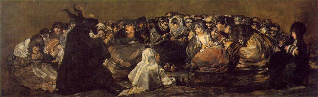
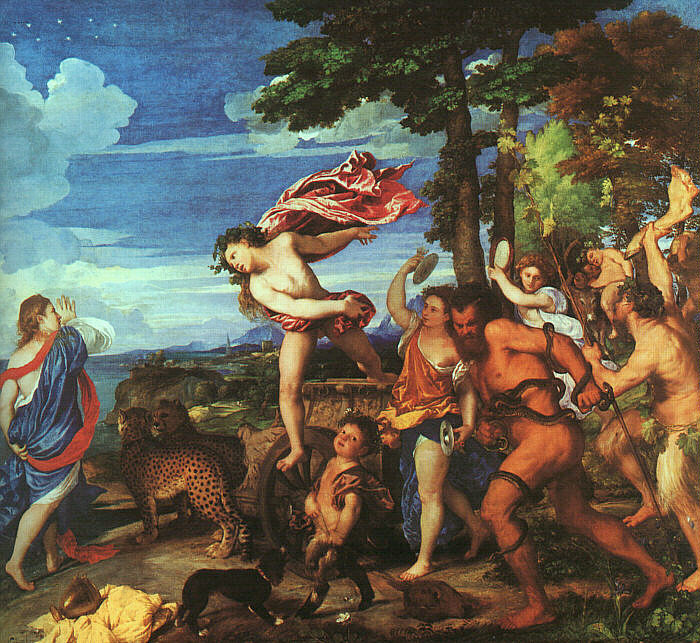
His influences in this period include the most notable Baroque masters. Velasquez taught him loose, fluid draftsmanship skills. Jackson raved about the revolutionary but subdued color palette and the amazingly intricate detail in a Velasquez from a distance compared to the loose brushwork and translucent glazes visible up close. Goya also uses those loose brushstrokes. He was influenced by Velasquez, but took his brushwork further and uses a similar palette in the dull red—deep brown—rich gray range. Caravaggio taught him minimalist backgrounds, beautiful contrasts of shade and light, and rich use of glazes. Vermeer used a similar color palette and a particular way of setting up, even staging, his scenes. Although Vermeer employed a small scale and utilized space (which Jackson does not need to do on these large canvases), Vermeer’s influence is obvious in the ways he glazed his colors, chose his range of shades, and used negative space. Manet also copied aspects of his color palette from Vermeer, and Jackson follows this line of inheritance.
Ryan saved his two most recent series, in this Baroque style, for last. First, he took me to a bright white wall on which hung his “Crucifixion” series. There are three paintings in this set that must be viewed together, in order. When I first saw them, I was very confused. What did those squares and rectangles mean? Then Ryan started talking, and I felt as if a curtain of confusion lifted gradually from the paintings and their real genius was revealed. He quoted 2 Corinthians 5:21, which reads: “For He made Him who knew no sin to be sin for us, that we might become the righteousness of God in Him.” He thought about Christ becoming sin. What was sin, to Christ? It was His opposite, His negative. How to depict that visually? Well, by punning on “negative.” So Ryan painted a version of a crucifixion by Bonnat, then had squares of photo-negative color gradually overtaking Christ. Here are the three images:


And then, last of all, Ryan took me around into the inside room contained within the classroom-studio. Here, in their deep Baroque glory and their jeans-and-tee-shirts contemporanity, were four astonishing works, commissioned by Calvary Chapel of Philadelphia. Each is a masterpiece of technique and an immediately visceral experience of human emotion. We talked the longest about the second piece, the party scene in which the prodigal son wastes all his wealth. There is just too much packed into this painting to express in full. There are elements allusive of Goya’s “Witches’ Sabbath,” Velasquez’ “Joseph’s Coat”, and Titian’s “Bacchus and Ariadne” (note the leg of beef on the right). Also, like Rembrandt, a self-portrait sneaks in. Can you find it? This self-portrait is the only figure with eyes; everyone else is empty, blind, and lifeless in this hell of false pleasure. Here are the four paintings in the series:

“Departure”

“Decadence”

“Broken”

“The Return”
IA: We don’t necessarily have to follow what’s being done now-a-days: we can be inspired by it, but we can forge our own way, or we can look at the past. RJ: Yes. Well, if you look at modernism, you have all these manifestos saying: This is the only way to paint—Surrealism, Cubism—here’s our manifesto for the next thing—Dadaism. And then you kind of get up to the ’70s, ’80s, and then, with, I guess Postmodernism, it becomes picking and choosing from all different styles. You’ll have, for instance, architecture that has several different styles, or paintings like Neil Rausch who has several different styles and techniques merging Abstract Realism. So I think it’s great that now-a-days we can use all sorts of things to create something new. IA: Would you consider yourself a member of a particular school of thought in painting? Give yourself a label? RJ: No. No, because I’m just exploring, just seeing what work comes out and where the Lord leads me. IA: Because you’re not sure where you’ll settle down or if you’ll keep exploring? RJ: Yes, and at this point I don’t know that I’ll ever settle into one thing, because it’s constantly learning, constantly exploring, constantly changing. Look at somebody like Picasso (not that I’m comparing myself by any means to Picasso! I’m nobody, but…) who has influenced so many different styles. He’s constantly getting bored with one thing and moving on to the next. He has influenced so many different styles: Surrealism, Cubism…. He would explore it until he came to the end of then road and then move to something else. II. THE NECESSITY OF HISTORICAL EXCELLENCE
IA: Another theme I’ve been picking up today is that as Christians in the arts, technique is just absolutely (to use a Pennsylvania phrase) “where it’s at.” You just absolutely have to master the skill. You can’t just have something to say. It’s not enough to say: “I want to communicate with the world.” You’ve got to study; you’ve got to work; you’ve got to learn the techniques, read the books, and so on. And that’s a mistake Christians in the arts make. They think: “God’s just going to inspire me, so therefore I don’t need to revise, or I don’t need to study, or I don’t need to know the history.” So what I’ve been impressed with today, as we’ve been walking around, (among other things) is your absolute dedication to the technique. Putting in the hours of the hard work. Have you seen that as a problem in Christian art? RJ: Yes, yes. Especially the Christian arts where things are, what’s the word, not “kitschy,” but there’s a lack of depth to it. And not that God can’t take anyone and use whatever. I don’t want to get so caught up in my human effort that it’s just me. It’s got to be the Holy Spirit. But also, I think, having studied art, seeing how rich art history is, and how there’s so much there, that’s the thing I’ve noticed. Especially in high school: They’re not teaching any art history. So I’ve actually started teaching seminars to art teachers. And I’ve found that most of the art teachers know nothing. They know Vincent van Gogh, and that’s it. Well, what are you teaching? There’s thousands of years of art history and you’re not touching it! And they just say, “Well, we don’t know anything about it.” If you come to teach English or math, you don’t just come in and teach whatever you want. You don’t say, “We’re going to make it up.” But when it comes to art, that’s what people tend to do, especially in high school. “Let’s just make it up. Let’s just make crafts. Let’s make flowers we can stick on Grandma’s fridge.” Well, as Christians, we should be creating the best. We’re doing it for our Lord, and this is what we’re giving him?! There are so many problems, I don’t even know if I can figure it out. But that’s one of the things I’ve been doing with my students. I’ve been teaching them through art history: here’s what happening, here’s what the people who have gone before you have done, here’s what they have accomplished. We learn from both older and contemporary artists. And that’s another problem. Even in other subjects, teachers stop about a hundred years ago. They stop at Impressionism in art. And I’m sure you’ve seen this in literature. There are the classics, which are great, and you need to know them. But what’s happening now-a-days: there are so many innovative things going on and major break-throughs. We can’t leave that out.
No comments:
Post a Comment